Client
Joe's Ice Cream & Co
Jake’s Ice Cream & Co
In the bustling world of ice cream branding, Jake's Ice Cream has become a standout local favourite, celebrated for its creative and fun approach to visual identity. Working with the existing vibrant brand logo, we developed cohesive packaging design and eye-catching signage, making our branding journey with Jake's Ice Cream nothing short of transformative. This strategic visual identity not only encapsulates the joy and indulgence of their delicious offerings but also bolsters customer loyalty and recognition. As industry experts, we understand the nuances of enhancing a brand to resonate with both the heart and the taste buds, and Jake's Ice Cream is a testament to the power of effective branding. Join us as we delve into the key elements that have made Jake's Ice Cream a trusted and beloved name in the community.
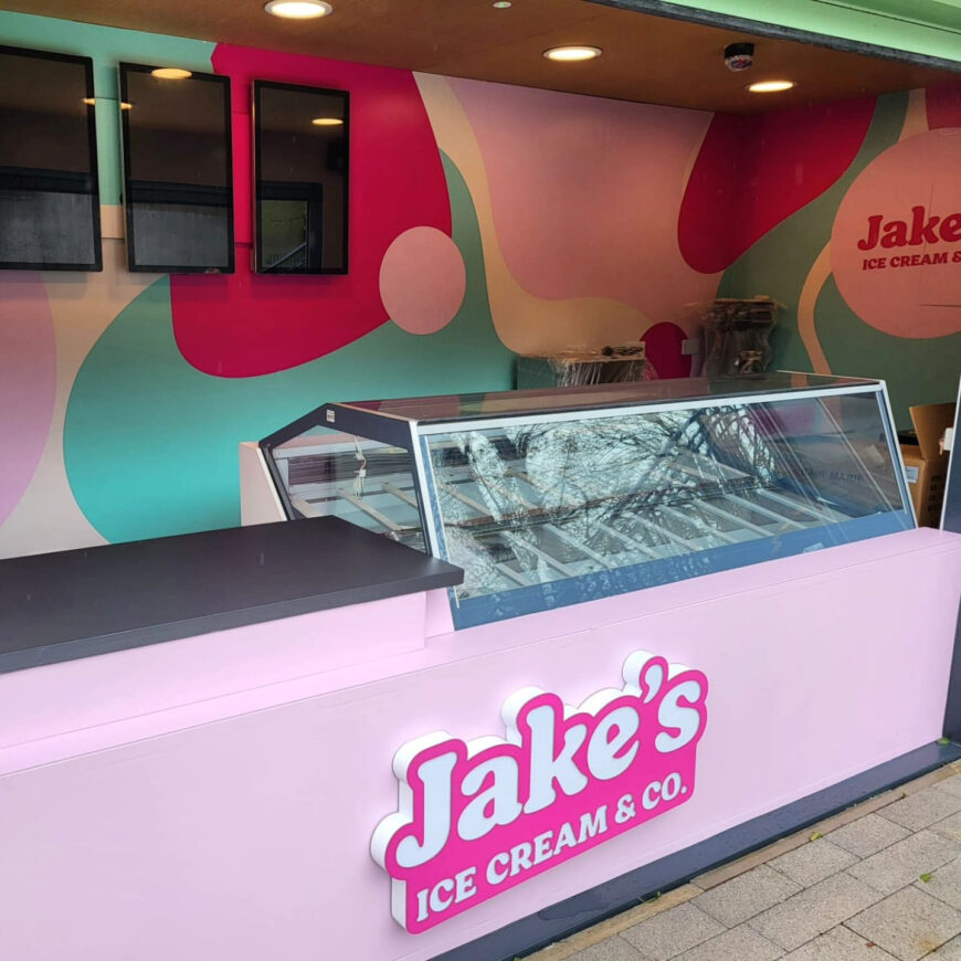
Crafting the Perfect Brand
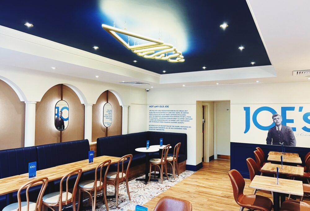
Working with Jake’s Ice Cream’s existing logo was a meticulous process. Our goal was to expand on their current branding, ensuring it stood out in the crowded ice cream market while capturing the playful essence of the brand. We began by exploring various color palettes, enhancing the fun and indulgence of Jake’s offerings. The updated brand identity incorporated elements reminiscent of classic ice cream parlors, blended with a modern twist to appeal to a broad audience. Typography played a crucial role, featuring a whimsical font that echoed the light-hearted nature of the brand. This cohesive brand look and feel became the cornerstone of Jake’s visual identity, appearing on everything from their packaging design to store signage. By providing a consistent and memorable image, the refreshed branding helped Jake’s Ice Cream establish itself as a local favorite, enhancing both customer loyalty and recognition.
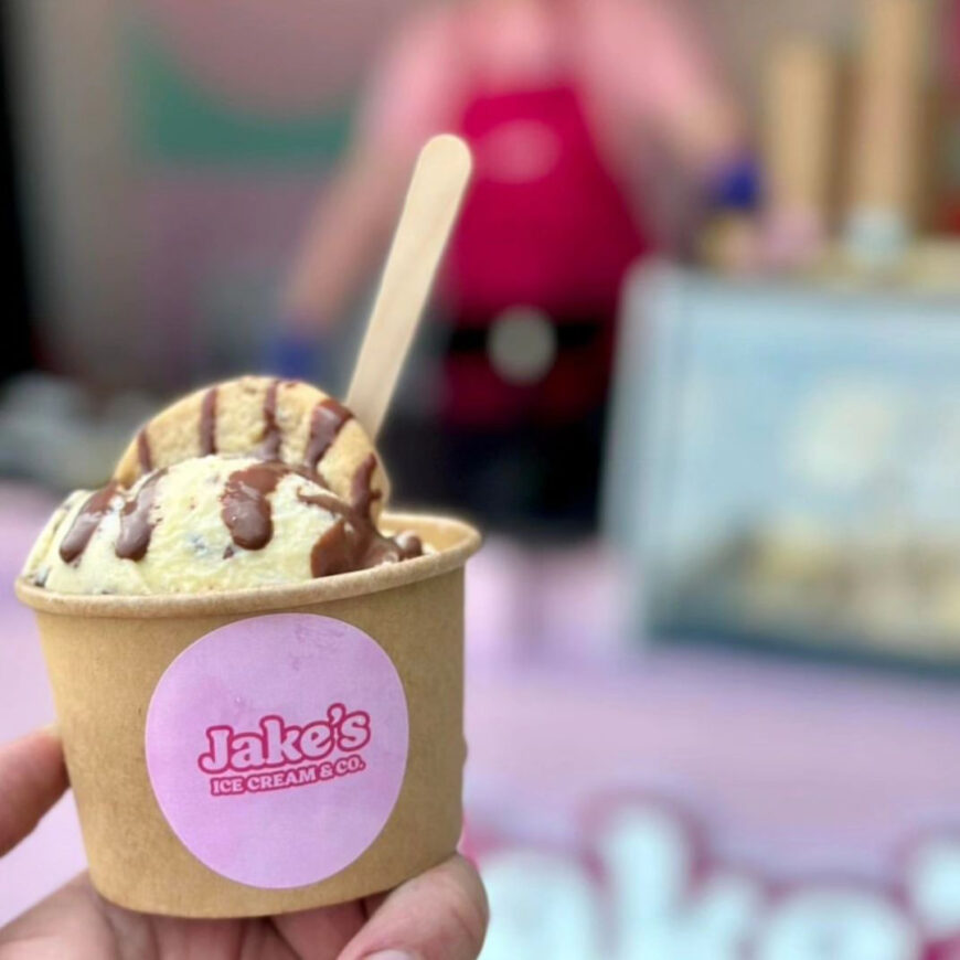
Creating Eye-catching Packaging Designs
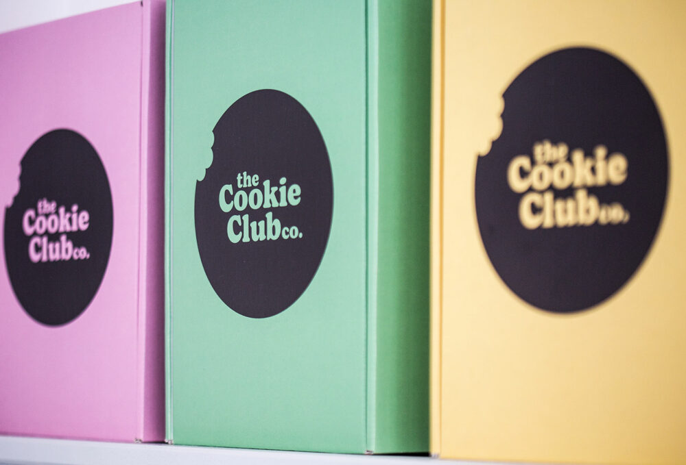
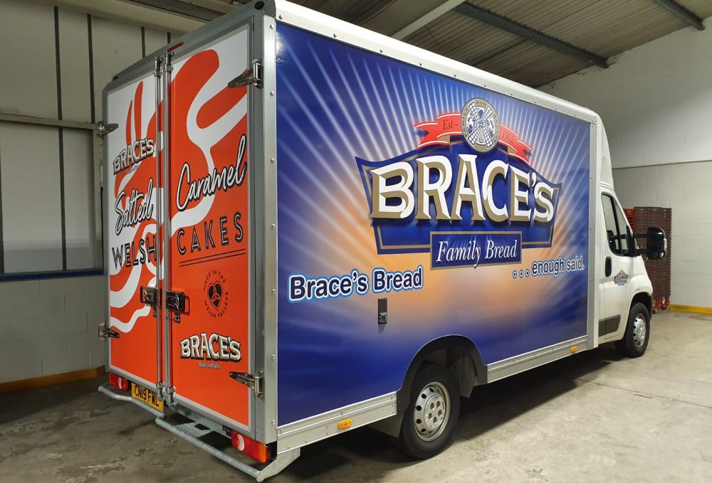
In the competitive ice cream market, packaging design plays a pivotal role in attracting and retaining customers. For Jake’s Ice Cream, the aim was to create packaging that was not only visually appealing but also reflective of the brand’s fun and creative spirit. We achieved this by using bold colours and playful illustrations that mirrored the vibrant flavours and unique personality of Jake’s offerings. Each package was designed to tell its own story, enticing customers with a visual promise of the indulgence inside. Additionally, the practical design of the packaging ensured ease of use and storage, adding to the overall customer experience. The packaging’s consistency with the rest of Jake’s visual identity reinforced brand recognition, making it easy for customers to spot their favourite products on shelves. This thoughtful approach to packaging design significantly contributed to Jake’s status as a local favourite, enhancing both immediate sales and long-term customer loyalty.
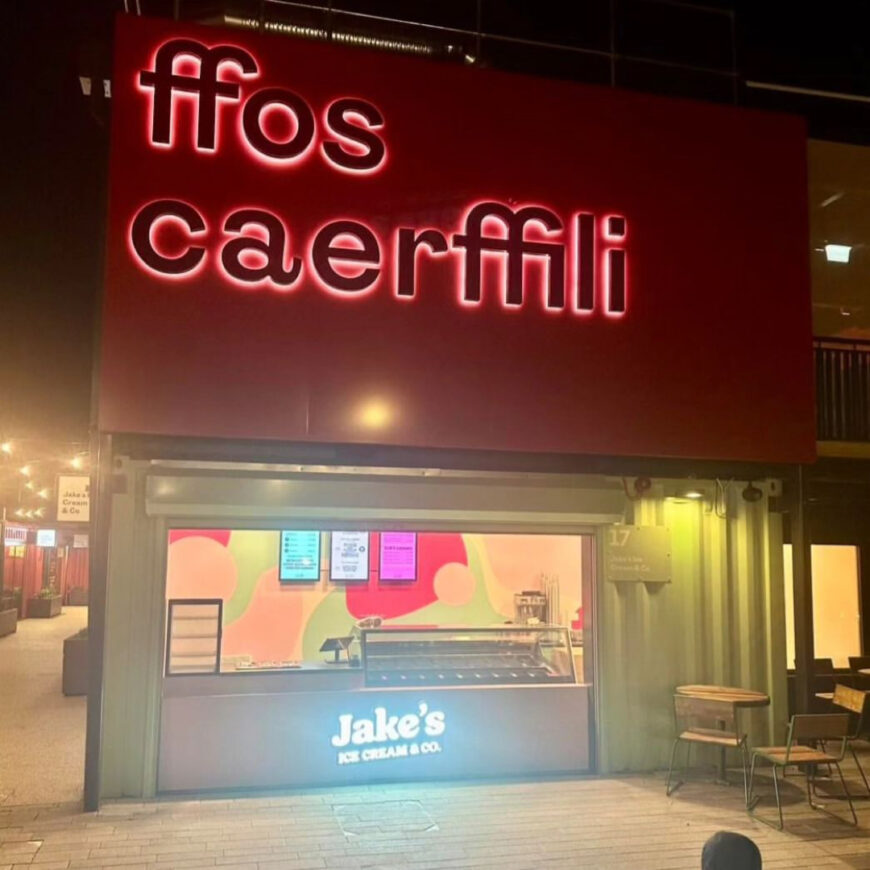
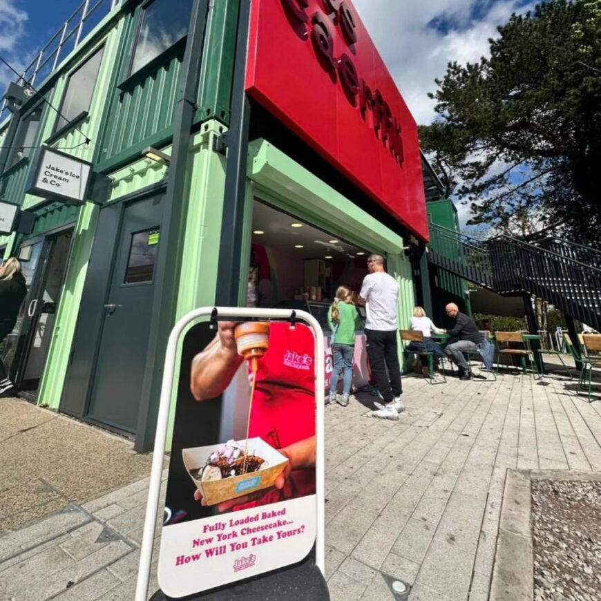
Signage: A Vital Branding Element
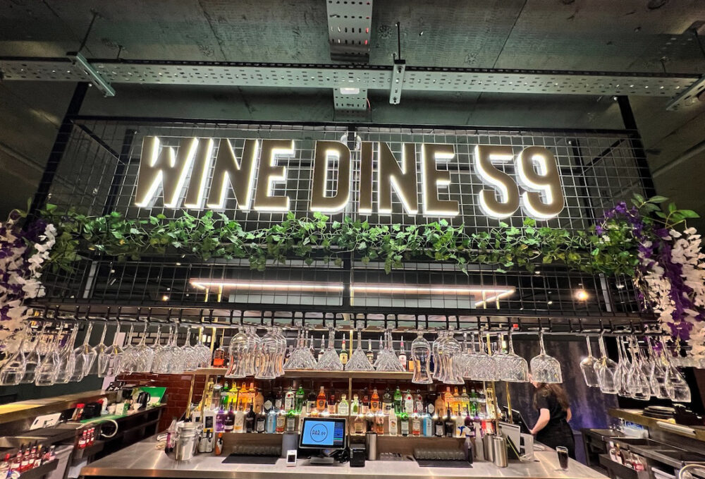
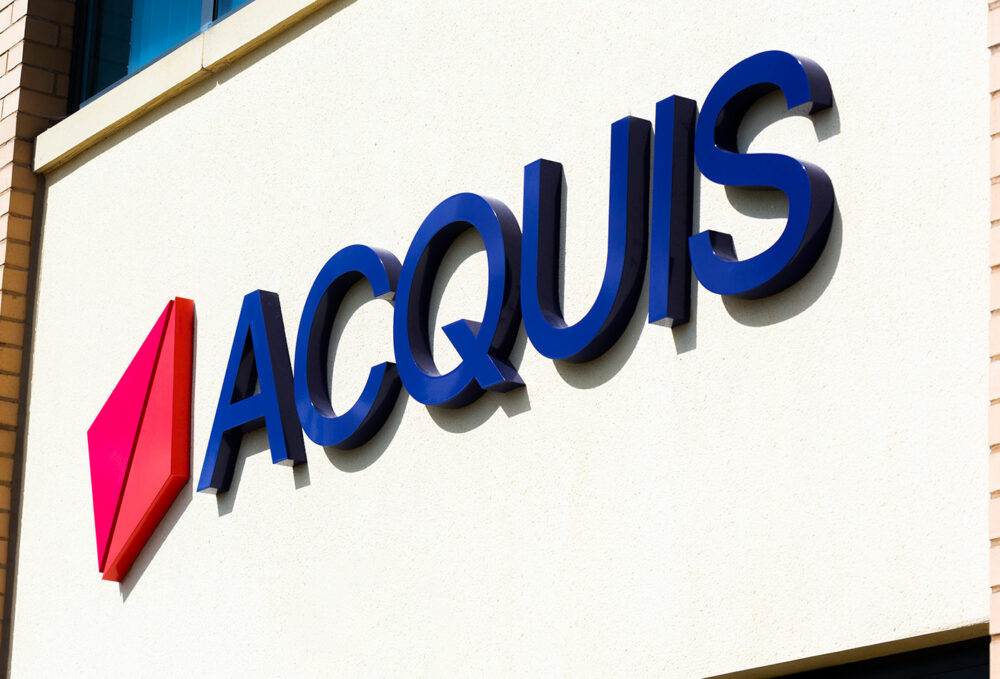
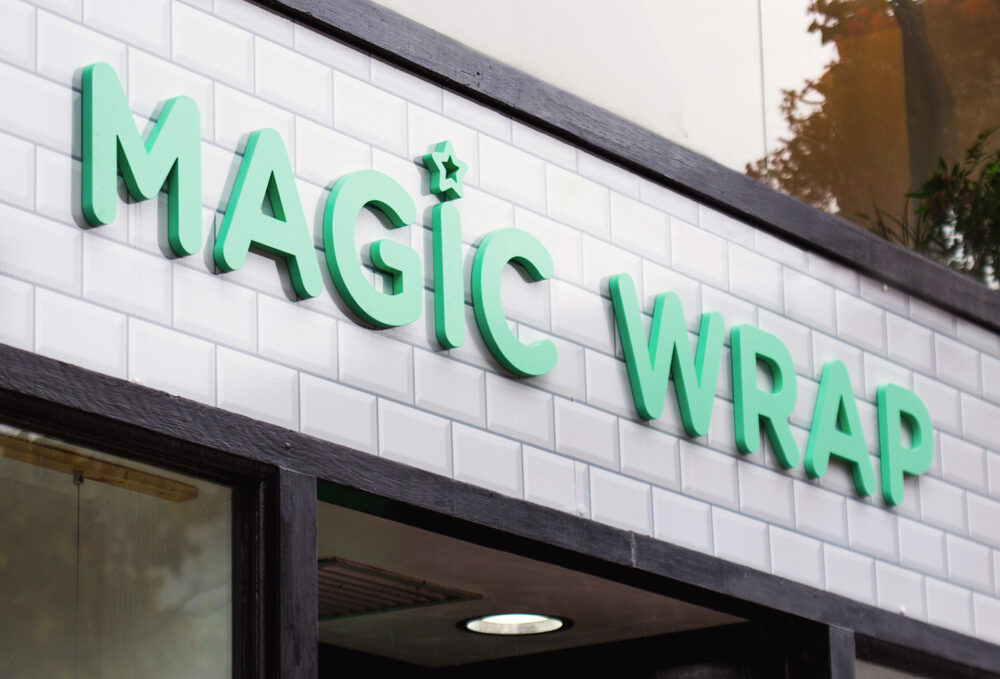
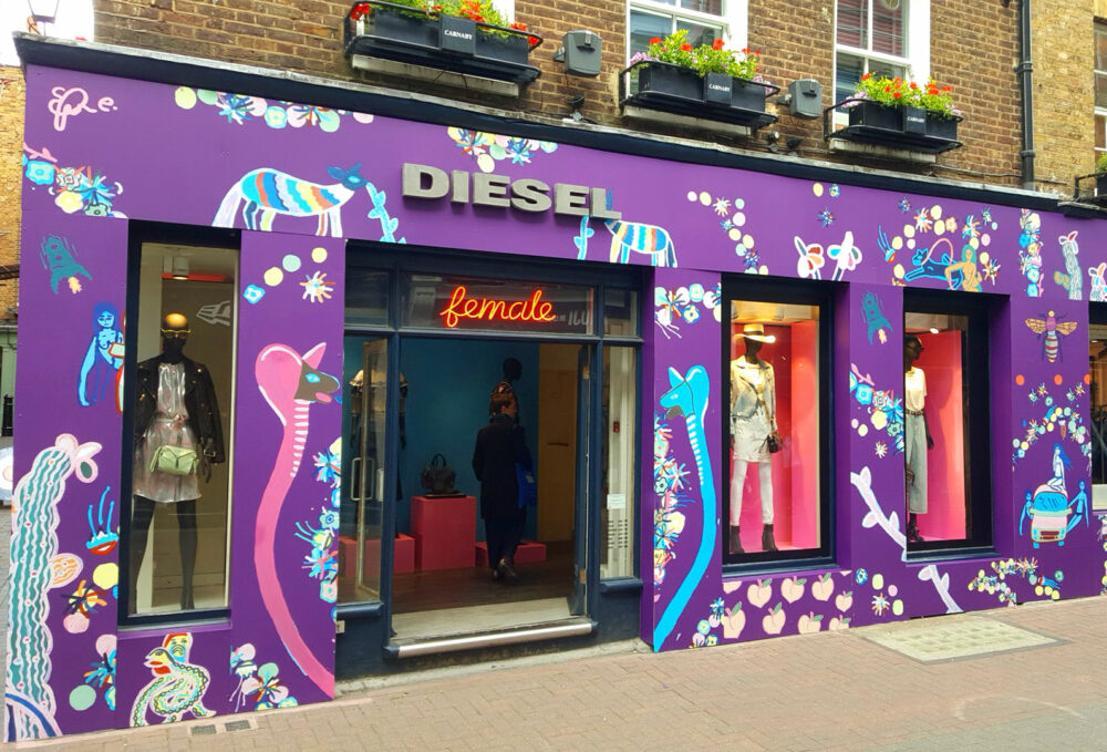
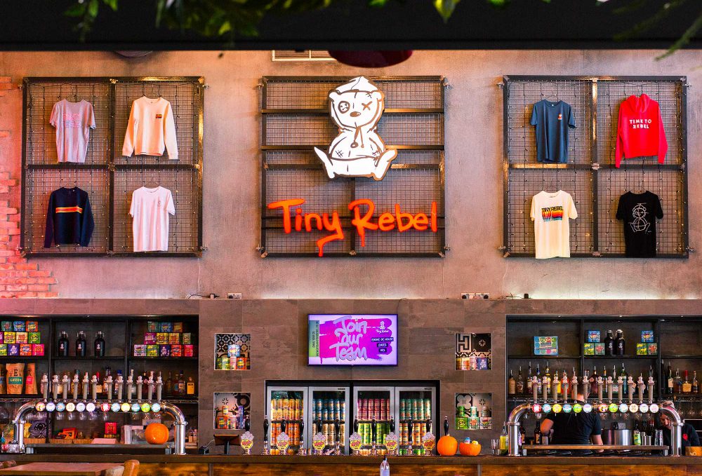
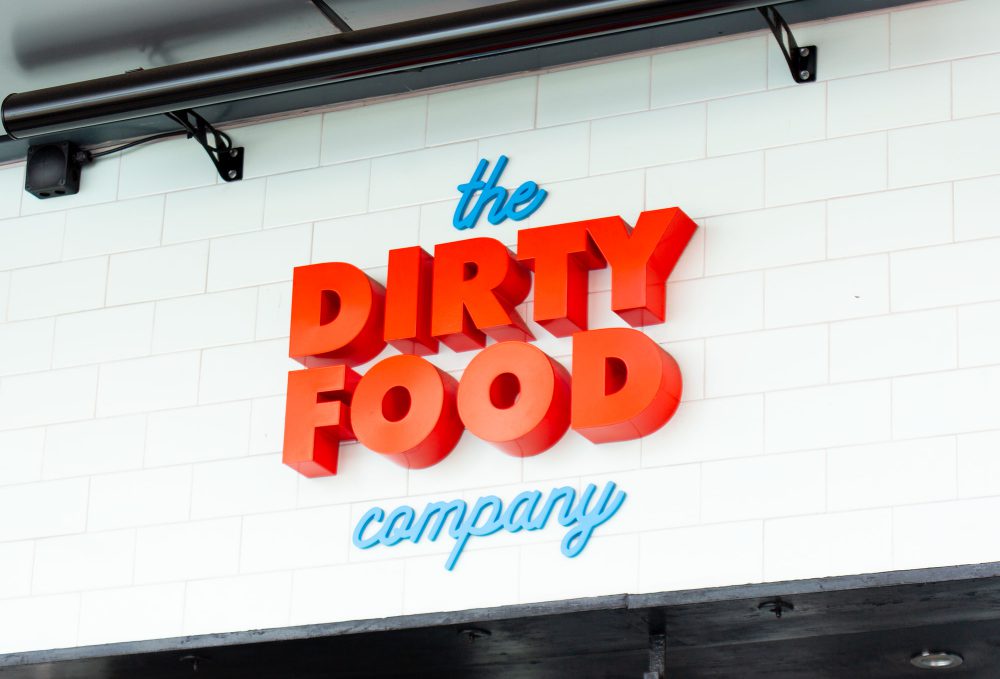
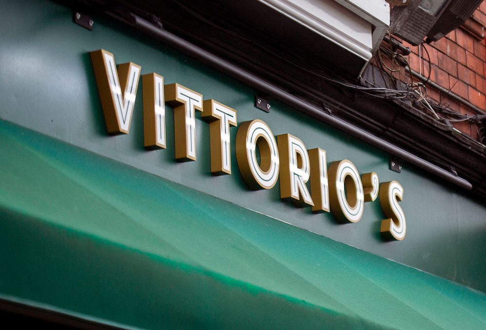
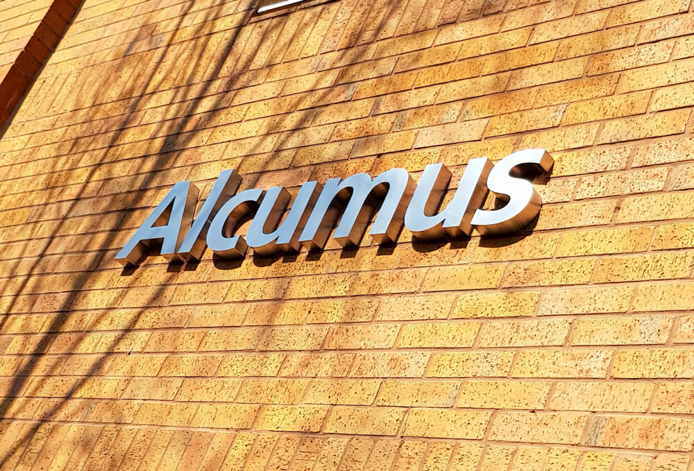
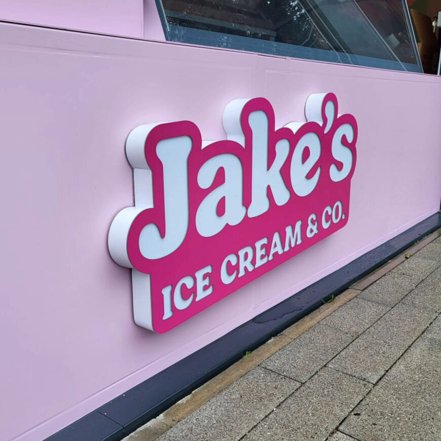
Signage is a crucial aspect of a business’s visual identity, acting as a beacon that draws in customers. For Jake’s Ice Cream, vibrant signage was essential to reflect the brand’s lively character and attract passers-by. We designed signage that harmonised with Jake’s overall visual identity, using bold colours and whimsical fonts to capture attention. The signage not only marked the physical location of Jake’s but also communicated the brand’s joyful promise to all who passed by. Strategic placement ensured maximum visibility, creating a landmark effect that made Jake’s a recognisable staple in the community. Additionally, the signage was designed to be memorable, encouraging first-time visitors to become repeat customers. By investing in eye-catching and cohesive signage, Jake’s Ice Cream enhanced its street presence and reinforced its status as a local favourite. This effective signage strategy played a pivotal role in building brand recognition and customer loyalty within the bustling ice cream market.
Get a quote
See how we can help you with your branding or signage project
Call us on 02920 361 848 to discuss your project
Request a quote online